John Tukey Type Quotations
John Tukey Quotes about:
Type Quotes from:
Quotes from famous authors


Popular tags & topics
-
 Art Quotes
-
 Beauty Quotes
-
 Friendship Quotes
-
 Future Quotes
-
 Happiness Quotes
-
 Hope Quotes
-
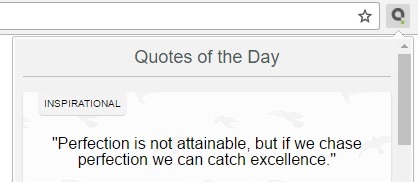
 Inspirational Quotes
-
 Leadership Quotes
-
 Life Quotes
-
 Love Quotes
-
 Morning Quotes
-
 Motivational Quotes
-
 Positive Quotes
-
 Romantic Quotes
-
 Success Quotes
-
 Time Quotes
-
 Travel Quotes
-
 Trust Quotes
-
 Truth Quotes
- Explore All Topics...


